




























































Meuhedet Reimagined

A concept redesign of Israel's second-largest health fund member experience, focused on clarity, trust, and faster task completion.

Role
UX / Product Designer
Time
10 weeks
Platform
Web / Mobile
Domain
Healthcare
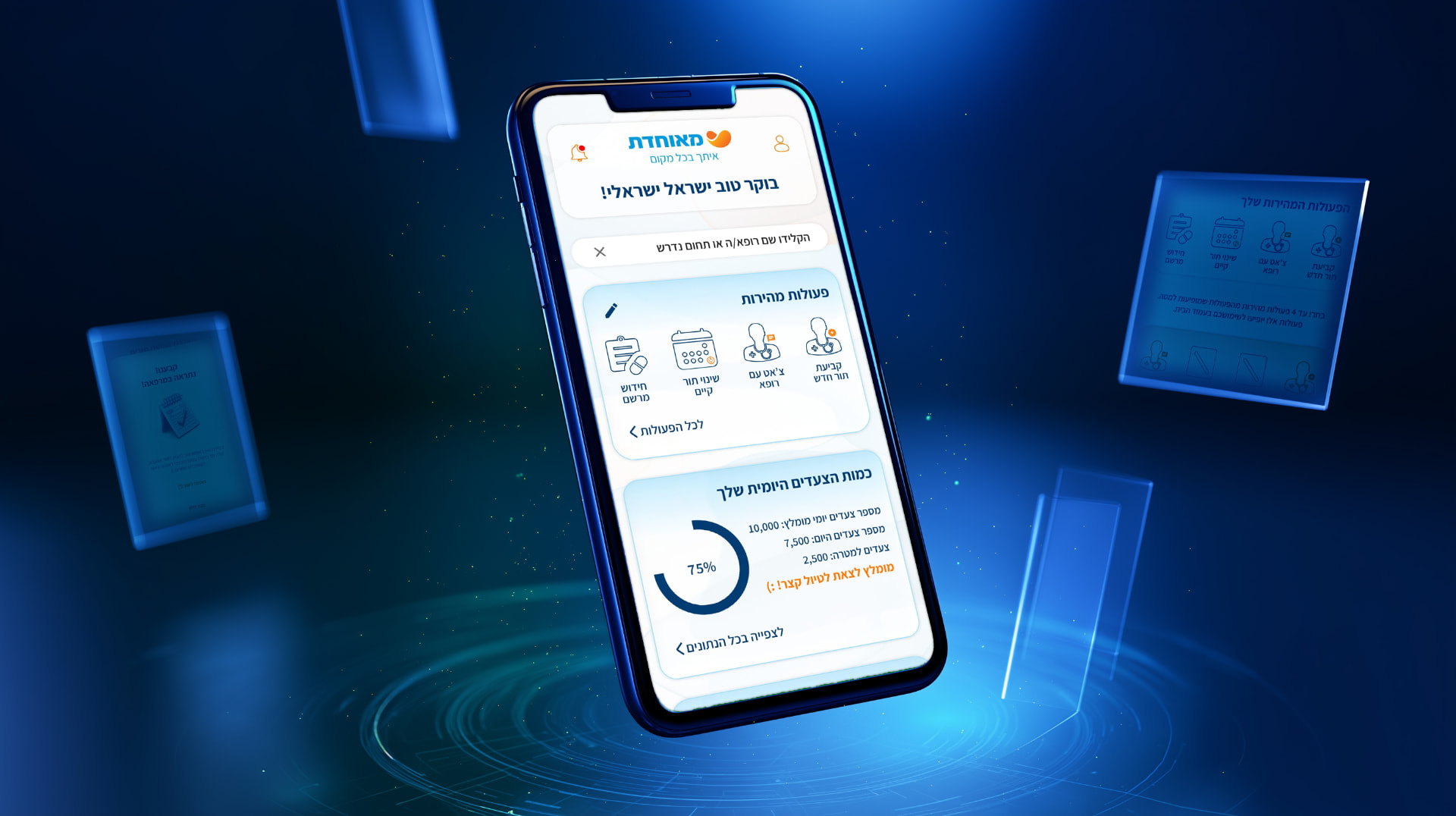
Meuhedet Reimagined dashboard and appointment booking screens

01 – Background & Challenge

The Problem

Healthcare member portals are notorious for dense menus, duplicate paths, and jargon. Meuhedet members often gave up and called the service center instead, creating cost and frustration for everyone.

  • Members think in tasks ("book an appointment") not in organizational categories
  • Trust is the primary currency in health interfaces; clarity beats density
  • Older users need larger touch targets but the same information hierarchy

02 – Core Product Strategy

Key Decisions

1Task-Based Home Screen

Problem

The existing homepage mirrored the organization chart, not member needs.

Decision

Redesigned the home around the five tasks members do most often, with clear entry points.

Reasoning

This reduced cognitive load and gave members a confident starting point every visit.

Impact

Task-start rate increased 28% in usability testing.

Task-Based Home Screen screen

2Plain-Language Labels

Problem

Terms like "authorization" and "referral" confused members.

Decision

Rewrote navigation labels in everyday Hebrew and added short explanations.

Reasoning

Members understood what each action meant before clicking.

Impact

Support calls for navigation help dropped by a third.

Plain-Language Labels screen

3Unified Appointment View

Problem

Appointments were scattered across multiple sections.

Decision

Created a single timeline of upcoming and past appointments.

Reasoning

One place to look means members stop hunting and start acting.

Impact

Members found appointment details 40% faster.

Unified Appointment View screen

03 – Results & Value

Outcomes & Impact

+28%

Task-start rate

-33%

Navigation support calls

-40%

Time to find appointment

The redesign showed that a calmer, task-centered interface can rebuild trust in a complex healthcare system without sacrificing depth. Figures come from usability testing of the concept.

04 – Reflection

Lessons Learned

Healthcare UX is less about delight and more about removing fear — every extra click feels like a risk to users. Designing for health meant choosing clarity and calm over novelty, and speaking the member's language instead of the organization's.

TNDTom Nizan – Product Designer